Paper Type Image: Elements of the Fine Press Book Special Collections Research Center
Page featured image content
Page main body content
Bird Library
01-01-2004 to 03-31-2004
The selections that make up this exhibit inevitably pose the same questions that arise whenever one attempts to determine the characteristics of a fine press work. Does such a printed item, for example, have to have a classic text (or at least one that has been deemed somehow an appropriate one)? Is it essential that it be letterpress-printed on a specialty stock in order to qualify for this assessment? Must it incorporate images that have been painstakingly rendered by hand or in a limited edition through a number of labor-intensive graphic arts processes? Is the manner of its sewing and binding alone a sufficient justification for regarding it as a fine press product?
The guiding principle in this particular exhibition has been to identify examples of relatively recent works, loosely deemed, within the holdings of the Special Collections Research Center that conjure up a sense of a cohesive book or print project in which the individual components have a unity that overcomes their disparateness. The publications that are displayed within these five cases in this foyer are, after all, largely collaborative efforts. It would have been extremely difficult for a single individual to accomplish all of the tasks that are associated with a book within this category. A successful fine press volume, it could be argued, must manage to convince us that a single vision of the work was effectively conceived, communicated, and executed, regardless of how many collaborators and production steps may have been involved in its creation. We invite you to explore for yourself how simple elements-type and paper, ink and image-can be variously combined into an artistic whole, a fine press book.
The exhibit was curated by William T. La Moy of Rare Books and Printed Materials.
- The Works of Geoffrey Chaucer: Now Newly Imprinted (Hammersmith, England: Kelmscott Press, 1896) One of the giants (or shall we say progenitors?) of English letters inspired the legendary union of the designs of Edward Burne-Jones, the wood engravings of W. H. Hooper, and the talents of William Morris at the Kelmscott Press, culminating in this classic folio work in 1896. The print run was limited to four hundred and twenty-five copies, and this massive volume was donated to the Syracuse University Libraries by the distinguished book collector Adrian Van Sinderen. The fully engraved title-page spread that is open to view includes the depiction of Chaucer in the midst of poetic creation. The original pen-and-ink drawing by William Morris for the initial o of the prologue of the "Tale of the manne of lawe" is situated next to the volume.
- Two Tales by Oscar Wilde (Paris: F. L. Schmied, 1926) The two short stories that are related in this book, "The Happy Prince" and "The Nightingale and the Rose," involve the tragic deaths of a sparrow and a nightingale, each sacrificing itself for the cause of true love. The engraver and printer F. L. Schmied and the bookbinder G. Cretté decided to use this emblem on the volume's magnificent art deco binding. Set into the morocco leather of the front cover is a panel with the image of a dying bird created with cracked eggshell and lacquer by Dunand after Schmied's design. The edition was limited to twenty copies. The opening displays Schmied's dramatic typographical treatment complemented by a horizontal band of engraving and explains the death of the nightingale:
"If you want a red rose," said the Tree, "you must build it out of music by moonlight, and stain it with your own heart's-blood. You must sing to me with your breast against a thorn. All night long you must sing to me, and the thorn must pierce your heart, and your lifeblood must flow into my veins, and become mine."
- Wild Pilgrimage: A Novel in Woodcuts by Lynd Ward (New York: Harrison Smith and Robert Haas, 1932) Just as the subtitle explains, the ambition of Lynd Ward in this graphic novel was to convey his entire narrative through his engravings in wood. Unlike an ordinary book, whose text runs across both sides of a leaf, the artist had his plates printed only on the recto side. This has the effect of having the "reader" examine one image at a time as the story unfolds. The artist/author also switches back and forth between a series of plates that are black and those that are a tone of red or burnt sienna to differentiate between internal and external spaces.
- The Ballad of Reading Gaol by Oscar Wilde (Paris: Daragnès [Insita Cruce], 1944) A truly impressive fine press work of an earlier period is represented by Oscar Wilde's The Ballad of Reading Gaol, as illustrated by Jean-Gabriel Daragnès (1886-1950) and bound in blind- and gold-stamped morocco by Gruel as one of only sixty copies. A loose oil sketch by Daragnès may be seen on the satin that has been attached to an endpaper, and it is juxtaposed with the actual copper plate used to create its printed form. The plate has been set into the specially designed inside cover (or doublure) of the volume. Gruel has incorporated the image of prison bars into his design. An additional curiosity of the book is that a textual error on page thirty-seven was corrected on the page because of the inability to obtain an exact paper match for the reprinting of it. The concluding verse of this work is a fabled and truly haunting one:
And all men kill the thing they love,
By all let this be heard,
Some do it with a bitter look,
Some with a .attering word,
The coward does it with a kiss,
The brave man with a sword!
- Anne Frank: Diary of a Young Girl (West Hatfield, Mass.: Pennyroyal Press with Jewish Heritage Publishing, 1985) A collaborative effort of the celebrated book designer Barry Moser with the illustrator Joseph Goldyne, this remarkable volume captures the essence of a fine press work. All of its constituent parts-its Mohawk archival letterpress paper, its composition by the Stinehour Press, its classic Bembo type, the printed renderings of the etchings by the firm of R. E. Townsend, and the Harcourt Bindery execution under the supervision of Samuel B. Ellenport-have been selected with the utmost care and with a view to a subtle integration that enhances the inherent power of the content. Note that the text has been impressed in a light gray ink, perhaps suggesting the fleeting nature of the commentary. The etching (signed by the artist) that appears near these entries is entitled Anne at Her Window, and an extract from this period of the diary reads as follows:
I have an odd way of sometimes, as it were, being able to see myself through someone else's eyes. Then I view the affairs of a certain "Anne" at my ease, and browse through the pages of her life as if she were a stranger.
- B-11226: Fifty Years of Silence, Eugene Kellner's Story by Tatana Kellner (Rosendale, N.Y.: Women's Studio Workshop, c1992) A plain pine box contains a book in a limited edition of fifty copies whose core is a simulated forearm and hand cast from handmade paper. The arm bears the designation of "B-11226" that was tatooed onto Eugene Kellner, the holocaust survivor whose saga is told by his daughter in this book. Tatana Kellner's parents agreed to write their reminiscences in Czech so that this testimony would not be lost. The Czech version of the narrative may be seen on the left-hand page of the open volume. The English translation on the right contains a description of the relentless "selection" process of a Nazi concentration camp, with a screened photographic image of an actual camp beneath the text:
When everyone was lined up, we were paraded in front of a podium where an SS officer stood as if he was a god. With a command "Mutzen ab!" ("Hats o.!") the man (who we later found out was Mengele) made his selection. Anyone who was not "healthy", [compositor's punctuation] who looked old or sick after the transport, was ordered to stand to the right, everyone else to the left. We waited a long time for the people on the right side to march on. Later we found out that with soap in hand, they went directly to the gas chambers.
- The White Spider: An Account of the First Ascent of the Eiger by Heinrich Harrer (New York: Limited Editions Club, 1996) In 1960, Heinrich Harrer published his harrowing account of the ascent of the north face of the Eiger (known as the White Spider because it appears to be lying in wait for its climbers). This version was designed and executed by Michael and Winifred Bixler of Skaneateles, New York. The font is a Monotype iteration of Eric Gill's Johanna set on Arches cotton-rag sheets. The goatskin on the front cover of the binding by Winifred Bixler actually incorporates mica from the rocks of the Eiger. The other striking dimension of the book is its photogravure illustrations, which were created by Jon Goodman of Hadley, Massachusetts, from the original photographs by the author. The text opposite the displayed print has some of the author's casual recollections before the actual attempt on the mountain:
Actually I was no longer a student by the time I got to Grindelwald. My tutors at the University of Graz were greatly astonished at the speed with which I suddenly attacked my Finals. I could hardly explain to them that I wanted my studies out of the way before I climbed the North Face of the Eiger.
- Real Things People Said and I Didn't Know What to Say by Thorsten Dennerline (Bird Press, 1997) This artist's book by Thorsten Dennerline has an accordion layout. It consists of quotations set in Courier type that are accompanied by copperplate engravings. The plate used to print "You have the right to remain silent" has been mounted on the front cover of this copy. The bindings for the edition of nine were designed and executed by Peter Verheyen of the Special Collections Research Center. The images from the book can be seen online at Bird Press.
- Match in a Bottle, Poems by Tracey Knapp, Drawings by Kurt Gohde (North Andover, Mass.: Kat Ran Press, 1997) The seven poems included in this book are illustrated in a unique fashion through the imaginative work of Kurt Gohde with materials that include kerosene, gold leaf, and gunpowder. The type was set by Michael and Winifred Bixler of Skaneateles, New York, with a Monotype version of Centaur by Bruce Rogers, and printed on Arches cotton-rag stock by Michael Russem. Winifred Bixler also bound the volume in its print run of sixty-five copies. Extracts from the beginning and conclusion of the poem "Fire as Your Tool" bind writing and fire:
The only real way
to completely remove words
from that which you have written
is to burn them.
The fire is not our problem,
remember,
it is the pen,
it is the paper.
- Saturday Night, 1953/The Elements by Samuel Milton Tickle Jr. (Freeville, N.Y.: Angorfa Press, 1998) This volume, a chapbook in form, was printed in letterpress Monotype Emerson on a Vandercook proofng press by Brad Benedict in a print run of seventy-five (this copy is number sixty-four). Donia Conn of the Special Collections Research Center bound the volume. The illustrations by David Robertson are almost cartoon-like in their broad-stroke approach. A very bright Johannot paper has been chosen to highlight the text and the images. An extract reveals the clear hearkening back to a previous era specified in the title:
if she wasn't standing ten foot tall on a banner out front with an alligator held delicately in each lily-white hand and a leopard skin two-piece accentuating her God-given form above the inscription "Bayou Betty, the untamed girl born deep in the Louisiana swamplands, wrestles all comers-man, woman or child-nightly. One hundred-dollar purse." and bringing in those crowds and cash, he would have cashiered her for sure when he saw she was having none of him, but that's all build-up for what I meant to tell you all along.
- Twenty-Six Words: An Alphabet Book with Twenty-Six Lithographs by Thorsten Dennerline (Bird Press, 1998) This alphabet book in an accordion format is composed of lithographs printed on a hand press at the University of Massachusetts. Each print is intended to suggest at least one meaning of the word with which it is paired in the volume. The lithographs and text were executed by Thorsten Dennerline. Peter Verheyen of the Special Collections Research Center created the bindings for the total run of ten of these volumes. The illustration for the word "obstreperous" is evocative. The book can be seen online in its entirety at Philobiblon.com.
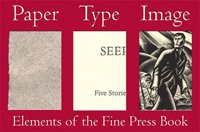
- Seep: Five Stories by Peter Orner (Iowa City, Iowa: Sierras Press, 1998) Jocelyn Webb was the designer and printer of this small volume that was produced in a run of twenty-six copies. The text has been set in Dante composed by Michael and Winifred Bixler of Skaneateles, New York. The illustrations consist of nine monoprints that were letterpress-printed with vinyl plates on the Frankfurt text stock. The book is opened to the images that accompany the story "Seep," and the following extract comments on the character of this "color":
She asked him to describe seep and he said, "At first you think it's green, but when you look harder you see it's not. That it's lighter. Violet, but not violet. Like the colors you see when you've closed your eyes for a while and then you look straight at the sun."
- Plant Dreams by Ann Marie Kennedy (Rosendale, N.Y.: Women's Studio Workshop, 1999) Ann Marie Kennedy has created a totally organic piece with her Plant Dreams. The concept for the book seems to revolve around the notion of plants serving our needs. In this instance, they have provided all of the components that make up the book. The string with which it is sewn, the paper on which the images appear, and the binding that secures it are all derived from plants. In fact, the wooden box that holds the book has a recessed space for a seed packet that is labeled "Dreams," and the same type of seed has been incorporated into the binding. If these are cotton seeds, they may serve as the symbolic source for the entire volume.
- "Winter Light": A Poem Reinterpreted by Emily Dickinson ([S.l.]: Jocelyn S. Webb, 1999) Emily Dickinson's poem "Winter Light" was transformed in November of 1999 by Jocelyn S. Webb through the media of Sumi ink drawings on handmade Okawara paper. Afterwards, the paper and its images were coated with beeswax, and the text of the poem was directly impressed with metal type onto the wax. This is copy number one of only nine.