Goudy at Syracuse: A Legacy by Design Special Collections Research Center
Page featured image content
Page main body content
Bird Library
08-14-2017 to 09-12-2018
Orange Central Opening Reception:
Thursday, October 5, 4:30 to 6:00 p.m.
In 1935, Goudy visited Syracuse University to address the New York Press Association at the fledgling School of Journalism (now the S.I. Newhouse School of Public Communication), laying the foundation for his personal connection to the University. It was the school’s dean, M. Lyle Spencer, who fostered the bridge between America’s foremost type designer and the program that became one of the premier institutions of communication in the country. The connection continues today through Syracuse University’s own graphic identity. The typeface, titled Sherman, whose original matrices Goudy himself once considered lost, were recently uncovered by the Special Collections Research Center at Syracuse University Libraries. The original design has been reinterpreted for the 21st century by Chester Jenkins of Village Type Foundry and Michael Beirut of Pentagram, the world’s largest independent design consultancy. The new digital font, based on Goudy’s original design, is the keystone for Syracuse University’s new branding.
Above: Frederic W. Goudy (left) receives his first honorary degree from Syracuse University in 1939, with dean M. Lyle Spencer of the School of Journalism. University Archives Photograph Collection.
Goudy @ Syracuse: A Legacy by Design tells the story of Frederic W. Goudy and his connection to Syracuse University. Through a selection of rare books, printed ephemera, and archival materials, original sketches, markups, and digital renderings from Jenkins and Beirut that showcase Goudy’s ongoing collaboration with Syracuse University, this exhibition explores not only the impact and importance of the famed type designer, but also celebrates the strong historical ties and entwined legacy of Goudy and Syracuse University.
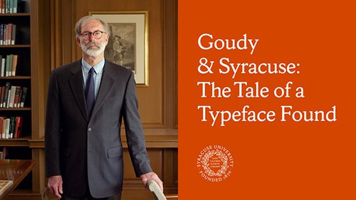
Above: Link to the mini-documentary that tells the tale of rediscovering Sherman, a typeface designed by Frederic Goudy in 1910 and revived by Chester Jenkins in 2016 for Syracuse University. Produced by Dress Code, New York.
Goudy first visited the city of Syracuse to address the New York Press Association during their fall 1935 annual meeting. Also in attendance was M. Lyle Spencer then Dean of the School of Journalism at Syracuse University. This meeting was the seed that would germinate into the lasting connection between Goudy and Syracuse University. The following year, Spencer and other members of the faculty were invited to Goudy’s workshop in Marlborough, New York, where Goudy had recently completed his 98th typeface. Spencer began to equip a typography laboratory in Yates Castle, the first home of the journalism school, anointing it the Frederic W. Goudy Typography Laboratory. Eager to bolster the relationship of his newly founded program to Goudy, in 1936 Spencer established the medal of distinguished service, and awarded the inaugural honor to Goudy. In 1939, Syracuse University was also the first institution to bestow Goudy with an honorary degree, and appointed him an official lecturer for the school in 1940.
Though Goudy died in 1947, his legacy at SU was preserved by many individuals. Professor David Norton used original Goudy artifacts and types while teaching typography, in addition to maintaining the Goudy Typography Lab for the School of Journalism, which later became the S.I. Newhouse School of Public Communication. Once the process of setting type was no longer part of the Newhouse curriculum in the 1980s, Don Cortese, professor of printmaking for the College of Visual and Performing Arts, salvaged the original Goudy type from being recycled. Cortese re-established the Goudy Typography Lab in the Comstock Art Facility, where it continues to engage students with Goudy’s original materials and process. The link between Goudy and Syracuse University also endures today through the University’s visual identity which embraces new digital versions of Sherman Serif and Sherman Sans.
In 2016, Syracuse University hired Pentagram, the world’s largest independent design consultancy, to create a new visual identity for the 21st century. When it was discovered that there was a unique connection between the University and Frederic Goudy, and that the Special Collections Research Center was in possession of original Goudy type matrices, the decision was made to incorporate these original artifacts into the project. Pentagram turned to type designer Chester Jenkins to revive the original 1910 Goudy design for a contemporary 2016 digital font. Jenkins worked closely with the design team from Pentagram and special collections curators to create the central element of new SU marque. “While I had Goudy’s original typeface as a starting point, where I ended up was a reinterpretation of Goudy’s idea, not a revival of his letters,” Jenkins explained. The result is a truly unique typeface that captures the spirit of Frederic Goudy’s design and continues the historic bond forged over 80 years ago.

Above: Original sketch for Sherman Book Italic by Chester Jenkins of Village Type Foundry. Chester Jenkins Collection, Special Collections Research Center.
Curated by Andrew J. Saluti, with William T. La Moy,
Special Collections Research Center
INTRODUCTION
Frederic Goudy was a designer, a teacher, a savvy businessman, a cat lover, a bibliophile, and a raconteur. Above all, Goudy was an artist. Over the course of his four-decade career, he designed over 100 typefaces, many of which are still used today, nearly a century after they were first introduced. Goudy’s dedication to his craft was apostolic; he wrote and lectured extensively on the design and aesthetics of typography and printing. He was revered in his own lifetime, gaining wide recognition and fame beyond his own circles (he even starred in a Hollywood film about his process); and with his wife, Bertha, he ran one of the most venerated private presses in America, The Village Press.
Goudy was a titan of American design and fine printing. Goudy @ Syracuse: A Legacy by Design tells the story of Frederic W. Goudy and his connection to Syracuse University. Through a selection of rare books, printed ephemera, and other archival materials, this exhibition explores not only the impact and importance of the famed type designer, but also celebrates the strong historical ties and entwined legacy of Goudy and Syracuse University. In 1935, Goudy visited Syracuse University to address the New York Press Association at the fledgling School of Journalism (now the S.I. Newhouse School of Public Communication), laying the foundation for his personal connection to the University. It was the school’s dean, M. Lyle Spencer, who fostered the bridge between America’s foremost type designer and the program that became one of the premier institutions of communication in the country. The connection continues today through Syracuse University’s own graphic identity. The typeface, titled Sherman, whose original matrices Goudy himself once considered lost, were recently uncovered by the Special Collections Research Center at Syracuse University Libraries. The original design has been reinterpreted for the 21st century by Chester Jenkins of Village Type Foundry and Michael Beirut of Pentagram, the world’s largest independent design consultancy. The new digital font, based on Goudy’s original design, is the keystone for Syracuse University’s new branding. Original sketches, markups, and digital renderings from Jenkins and Beirut showcase Goudy’s ongoing collaboration with Syracuse University and secure his legacy in the University’s history.
FREDERIC W. GOUDY
Goudy was born in Bloomington, Illinois, in 1865. As a young man, his future as a nationally recognized typographer was not predestined. He had only occasionally dabbled in lettering; he created an installation of the verses of the Ten Commandments on the walls of a Presbyterian Sunday School room when he was 16, and later, was commissioned to paint the name of a local baker on the side of his new truck. Goudy’s penchant for design brewed while he bounced from job to job in the mid-west: working for his father’s real estate business in the Dakota Territory, starting a soon-to-be failed mortgage and loan company, and briefly finding employment as a department store bookkeeper in Minneapolis. It wasn’t until his move to Chicago in 1890 that Goudy would be introduced to the larger world of design and fine printing, to the work of William Morris and the Arts and Crafts movement, and to his future wife and collaborator, Bertha Sprinks. Chicago of the 1890s was a city bustling with creative energy. The World’s Columbian Exposition, also known as the Chicago World’s Fair, was organized to celebrate the 400th anniversary of Columbus’ voyage. A constant stream of public dialogue focused on design and architecture as the city readied itself for the event. It was during this time that Goudy became enchanted with finely printed books from William Morris’ Kelmscott Press and other private presses in England. He also began to study early Renaissance books, and, in 1894, acquired financial backing to set up his own press. Story of the Glittering Plain, also called the Land of Living Men, or the Acre of the Undying. Written by William Morris. (Hammersmith: Kelmscott Press, 1891) This is the first publication printed at the Kelmscott Press, and represents a quintessential example of Morris’ work and the Arts and Crafts movement that inspired and influenced Goudy early in his career. The integration of text and image in Morris’ elaborate border design reference a medieval manuscript composition, magnifying the value of that aesthetic illumination in a contemporary The Chap-Book, vol. 2, 1895. (Chicago: Stone and Kimball, 1894-1898) Goudy’s first major commission under the publishing title The Camelot Press. Goudy’s courage to even bid for the job is astonishing, considering at the time he only had the equipment to create a simple pamphlet. Contributors to the periodical included H.G. Wells, Paul Verlaine and Stephen Crane, and employed illustrators such as John Sloan, Aubrey Beardsley and Henri ToulouseLautrec. Denslow's Mother Goose, edited and illustrated by W. W. Denslow. (New York: McClure, Phillips & Company, 1901) Goudy met newspaper artist W. W. Denslow while teaching at the School of Illustration in Chicago in 1900. Shortly after its publication, according to Goudy, the Inland Type Foundry of St. Louis issued a new typeface “copied-not inspired-from the Denslow lettering, and added insult to injury by naming it Hearst”. The colophon indicates "The verses in this book have been handlettered by Fred W. Goudy." The Hollow Land by William Morris. (Hingham, MA: Village Press, 1905) The Hollow Land was the third publication of Goudy’s Village Press, and again draws a direct connection to the influence of William Morris. The printing began in 1903 at Park Ridge, Illinois, and continued after the move to the press’ second location in Hingham, Massachusetts. An unfinished ‘dummy’ copy was exhibited at the Louisiana Purchase Exposition in Saint Louis in 1904. A majority of the 220 printed copies were destroyed by the press’ first fire in January of 1908. The Door in the Wall, and Other Stories, by H.G. Wells. (New York: Mitchell Kennerley, 1911) After moving his press to New York City in 1906, Goudy reached out to publisher Mitchell Kennerly for work. For this book, Goudy found the Caslon type to open for his liking, and designed the Kennerly face, named for the publisher. Kennerly Old Style would become Goudy’s first major typographical success. A traditional Roman style was designed in 1911, an italic in 1918, and a bold version in 1924. Photograph of Frederic W. Goudy, inscribed to M. Lyle Spencer, 1938 David M. Norton Collection on Frederic W. Goudy Frederic W. Goudy and the Marchbanks Press announcement folio, 1917 Frederic W. Goudy Collection While Goudy operated his own press, he routinely accepted (and pursued) outside commissions, and held official positions at other companies. The collaboration between Goudy and The Marchbanks Press lasted for many years, with Goudy as a contracted designer, and with the press printing many of Goudy’s publications. Goudy also held the title of art director for the Lanston Monotype Company in Philadelphia, Pennsylvania from 1920 to 1939. Making the Design inscribed ‘Fred W. Goudy’ photograph Original Goudy boarder design for Marchbanks Press Original monogram design for Marchbanks Press, drawn by Goudy Original A and S Goudy letter designs for Marchbanks Press Frederic W. Goudy Collection Original Goudy design for a Woodrow Wilson binder’s stamp Original W, T, and I Goudy letter designs for Marchbanks Press Frederic W. Goudy Collection These initials were designed for a special printing of President Woodrow Wilson’s declaration of war address to Congress on April 2, 1917. Original Goudy letter design variations on the original Caslon lowercase p Frederic W. Goudy Collection Throughout the 19th century, the English Caslon typeface was a standard for printers on both sides of the Atlantic. This original drawing illustrates Goudy’s process to reinterpret the original design. Introducing for the first time the new series of Goudy Oldstyle. (Boston, MA: American Type Founders Co., 1916) Arguably one of Goudy’s most enduring designs, Goudy Oldstyle was revered for both its design and its functionality. Released by the American Type Founders Company, the typeface was advertised: “Its graceful letterforms made it visually appealing, while its shortened descenders allowed printers to squeeze more type on a page.” A Specimen Sheet of Goudy Old Style, printed in 1948. David M. Norton Collection on Frederic W. Goudy Lincoln’s Gettysburg Address was used to illustrate the various sizes and styles of the popular typeface design.
GOUDY AND DESIGN
Goudy is regarded as one of the preeminent forces in American design, completing a staggering 122 original typefaces during his career. And, even though he developed his first unique alphabet at the age of 30, Goudy refused to acknowledge himself as a professional typographer until he was 46. His approach to design grew from the influence of the Arts and Crafts movement—a marriage of form and function—where legibility and unique but careful design work went hand-in-hand. Goudy lectured on the importance of legibility above all, while at the same time insisting on an original creative presence. Goudy also opined against the nascent style of modern design, reasoning that over-polished or streamlined techniques lacked the character and idiosyncrasies of the hand of the artist. This predilection is evident in his work, as Goudy developed almost no sans serif types (typefaces that do not include small tails, lines, and flourishes, such as Arial or Helvetica). His treatise on what made good design was guided by three governing principles: “[F]irst, simplicity, that is, a form having no unnecessary parts; second, contrast, as shown by marked differences in the weight of the lines composing the individual letters, and also as shown in the varying width of different letters; and third, proportion, each part of a letter having its proper value and and relation to other letters—these three things in connection with the aspects of purpose and use.” [Bruckner, Frederic Goudy: Masters of American Design. New York: Abrams, 1990.] Page 4 Goudy Text & Lombardic Capitals: two new monotype faces designed by Frederic W. Goudy. (Philadelphia, PA: Lanston Monotype Machine Company, c1931) The Alphabet: Fifteen interpretative designs drawn and arranged with explanatory text and illustrations, by Frederic W. Goudy. (New York: Mitchell Kennerley, 1918) This is one of the earliest examples of Goudy’s academic endeavors concerning the history of type and printing. The publication would have numerous reprintings, and later would be combined with its sister publication Elements of Lettering, most recently in 1989 by Marboro Books. Together, these two volumes continue today to anchor many courses on the history of design and typography. The Elements of Lettering by Frederic W. Goudy. (New York: Mitchell Kennerley, 1918) This publication was intended as the companion to The Alphabet. The title page reads: “Text composed by Bertha M. Goudy in types designed by the Author”. Published by Mitchell Kennerly and printed at The Marchbanks Press, the book was dedicated to C. Lauron Hooper, the educator who assisted in the financing of Goudy’s first printing venture, The Booklet Press, in 1894. Printed proof of page 16 from The Elements of Lettering. Frederic W. Goudy Collection In this trial proof, Goudy indicates an incorrect setting of the letter ‘o’. The letter is slightly elevated on the line of text, signifying the metal type was placed upside-down. Types by Goudy broadside Frederic W. Goudy Collection
THE VILLAGE PRESS
In 1894, Goudy embarked upon his first official venture into printing with the short-lived Camelot Press (initially called the Booklet Press). After its closing in 1896, Goudy returned to bookkeeping while also taking on design commissions for various publishers. In 1900, Goudy was invited to join the faculty of the newly-founded School of Illustration in Chicago. It was there he met a young student, Will Ransom, who, in 1903, partnered with Goudy to establish The Village Press in Park Ridge, a suburb of Chicago. The name of the press came from Henry Wadsworth Longfellow’s poem “The Village Blacksmith.” Over the course of more than three decades, the press would occupy seven different locations, endure two catastrophic fires, and become one of the most prolific and longest-running private presses in the United States. Old Mill at Deepdene printing block Charles Pont Collection related to Frederic Goudy Charles Ernest Pont (1898-1971) was a French-born Swiss-American painter, printmaker, magazine/book illustrator, lecturer, writer, and Baptist minister. Working as an illustrator during the Great Depression, he met Goudy in the 1930s and proposed to collaborate on a biography of the type designer, never completed during his lifetime. This block depicts Goudy’s mill, the final home of The Village Press, destroyed by fire in 1939. Charred piece of wood from the Old Mill at Deepdene Charles Pont Collection related to Frederic Goudy On the morning of January 26, 1939, Goudy’s mill at Marlborough-on-Hudson, home to The Village Press and Type Foundry, Page 5 burned to the ground. Goudy once again lost the majority of his work due to the blaze. He would not rebuild or relocate the press, though the School of Journalism at Syracuse University purchased a matrix engraving machine, at Goudy’s disposal for the remainder of his life. Printing, An Essay, by William Morris & Emery Walker. (Park Ridge, Il: Village Press, 1903) This is the first publication of The Village Press, and the first published use of Goudy’s Village typeface. The text originated from Arts & Crafts Essays by Members of the Arts and Crafts Exhibition Society. This publication, in addition to Goudy’s printing of The Hollow Land, was exhibited at the Louisiana Purchase Exposition in Saint Louis in 1904. The Village Press: an announcement of its work and aims, together with a list of its publications. by Frederic and Bertha Goudy. (New York: Village Press, 1906) Catalog for The Village Press: A Retrospective Exhibition, 1903-1933. (New York: American Institute of Graphic Arts, 1933) The retrospective exhibition was held at the American Institute of Graphic Arts in New York City. The book includes an introductory essay by Will Ransom, co-founder of The Village Press, and a hand-tipped photograph of Frederic and Bertha Goudy in the workshop (shown). Intimate Recollections of the Village Press, by three friends. (Marlborough, N.Y.: Village Press, 1938) Essays include In the beginning, by Will Ransom, Hingham interlude, by Charles E. Park, and Metropolitan memo, by Mitchell Kennerley. Original Type set by Goudy, “The Village Press” Goudy monogram type, 36 pt. Village Press monogram type, 30 pt. Charles Pont Collection related to Frederic Goudy Village Press: Surprise! 1992. David M. Norton Collection on Frederic W. Goudy Printed card including Goudy’s original monogram and The Village Press type composition, printed at Spare Moments Press by David Norton. A Bibliography of The Village Press, 1903–1938, by Melbert B. Cary and Frederic W. Goudy. (New York, N.Y.: Press of the Woolly Whale, 1938) The first comprehensive account of the Village Press, Cary used his own collection of printed materials as reference for his bibliography. The text includes an account of the genesis and history of the Press by Goudy, and a portion of co-founder Will Ransom’s 1903 diary. The photograph on this page depicts The Village Press at Deepdene, in Marlborough-on-Hudson, New York. A reproduction of the fifth mark of the Village Press, circa 1912. This logo was based on the 1481 press mark of Venetian printer Johannes de Colonia.
THE STORY OF VILLAGE AND SHERMAN
Goudy originally designed his Village typeface for the Kuppenheimer Clothing Company in 1902. Based on a variety of original faces including Jenson and William Morris’ Golden type, the commission was for an advertising “display” typeface, and not a “book” face, so the design was turned down. Goudy used Village for his own press for over 6 years before selling the matrices to another publisher, Frederick Fairfield Sherman. Sherman later commissioned a unique type for himself, and in 1910 Goudy designed Sherman. Goudy later recalled that he and Sherman “quarreled over other business” and the two never communicated again. The original Goudy matrices for Sherman (and some for Village), the contracts, and the inventories found their way to Sherman’s niece, Mrs. George B. Englehardt. Discovering the connection between Frederic Goudy and Syracuse University, Mrs. Englehardt donated these artifacts to Syracuse University. Seven matrices of the original Village type designed by Frederic W. Goudy. Frederic W. Goudy Collection These matrices survived a fire on January 10, 1908 in the Parker Building at 225 Fourth Avenue in New York City. Goudy had accepted an offer by the superintendent of the building to put the matrices in his office safe, and that safe was the only object to withstand the conflagration on that floor of the building. The original contract and inventory for Frederic W. Goudy’s Village type, sold on November 3, 1909, to Frederic Fairchild Sherman. Frederic W. Goudy Collection The matrices for Village type, as well as the contract and inventory for it, were donated to Syracuse University by Mrs. George B. Englehardt, Sherman’s niece. The matrices for the lowercase and capital roman letters of the Sherman typeface. Frederic W. Goudy Collection Sherman was designed and sold by Frederic W. Goudy to Frederic F. Sherman in 1910, almost exactly a year after Mr. Sherman had purchased Goudy’s Village type. The original contract and the inventory for the Sherman typeface designed by Frederic W. Goudy for Frederic Fairchild Sherman. Frederic W. Goudy Collection Sherman would ultimately only use this typeface for a small number of short-run publications of his own production, but Syracuse University has interpreted a digital version of this font for its institutional use. This was possible because Mrs. George B. Englehardt, Sherman’s niece, donated the original Sherman contract, inventory, and matrices to the university. Proof specimens printed on dry and dampened paper of the type cast by the American Type Founders for Syracuse University from the original matrices of the Sherman type. Frederic W. Goudy Collection Goudy’s only complaint about the font was its “close fitting”: “The drawings were really beautiful, but the type as cut in 14-point proved difficult to use. I had at that time, due to inexperience, concluded that ‘close fitting’ of a type was a sine qua non, and in the Sherman type I went to extremes.” When Chester Jenkins of the Village Type Foundry created the digital version of the Sherman typeface for Syracuse University, he addressed this issue most successfully. Pages two and three of a prospectus entitled Frederic Fairchild Sherman’s New Publications. (New York: Frederic Fairchild Sherman, 1911) On page two on the left side, the publication discussed is A Painter’s Holiday and Other Poems by Bliss Carmen. This was intended to be a limited edition of one hundred and fifty copies on Italian handmade paper, printed in Sherman type with an explanation the font to be utilized: “A special effort has been made to present these poems in a manner befitting their importance and to that end this publication has been chosen as the trial impression of the new Sherman type, designed by Mr. Frederic W. Goudy, who has consented to enrich the work with several decorative initials and a hand lettered title-page. As with Mr. Sherman’s other publications no expense will be spared in the effort to make it a really distinguished example of modern bookmaking.” On page three on the right side, the second work discussed in the prospectus was entitled George Inness: The Man and His Art by Elliot Dangerfield. This was planned as an edition of two hundred and fifty copies, and it employed (as did the blurb) the other Goudy typeface owned by Sherman: “The volume, printed from Mr. Sherman’s Village type on Italian hand-made paper, and illustrated in color and photogravure, will rank with the most noteworthy of his publications as an example of artistic bookmaking.”
GOUDY AND BERTHAM
On Monday, March 30, 1936, M. Lyle Spencer, Dean of Syracuse University’s School of Journalism, announced that the University’s new typographical laboratory would be named in honor of Frederic W. Goudy on the completion of his 100th type design. That typeface, named Bertham in honor of Goudy’s late wife and partner, Bertha M. Goudy, was completed in the summer of 1936. This case documents the evolution of the formal tribute composed and printed by Frederic W. Goudy in honor of his deceased wife. An autograph letter (signed) from Frederic W. Goudy to [Alpheus] Sherwin Cody dated 18 August 1935. Frederic W. Goudy Collection Written by Frederic W. Goudy in Marlborough, New York, to his old friend [Alpheus] Sherwin Cody (who is best known for having devised a longstanding home-study course on writing English clearly and effectively) on August 18, 1935. Goudy’s letter explains the difficult circumstances that befell his wife: Bertha [Goudy’s wife], poor woman, had a slight-stroke, cerebral thrombosis, a year ago last Dec[.] and practically is a helpless invalid, cheerful but quite feeble and her illness left her with a little thickening of her speech so that at times it’s difficult to be sure just what she is saying. I’ve learned pretty well now how to interpret—we make a sort of game of it so as not to let her think it’s serious. I’m pretty good, working on my 95th or 96th type—I can’t keep track of ’em anymore. Have to ease up a bit—can’t run up or down stairs or lift heavy weights—on Doctor’s advice cut down from 16 hrs work a day to 12, so as to get something done—otherwise OK. For Bertha not to be able to be up & doing is like a jail sentence after 30 odd years helping me. Death notice for Bertha M. Goudy Frederic W. Goudy Collection “beloved wife, mother, and sister, Monday, October twenty-first, nineteen hundred thirty-five at Deepdene, Marlborough-onHudson, New York.” An article entitled Genesis of My 100th Type on pages thirteen through fifteen of The American Printer for July of 1936 Frederic W. Goudy Collection On May 30, 1936, Goudy received a commission from Laurence Siegfried, the editor of the journal The American Printer, for a new typeface that would effectively be his one hundredth font. In accepting the editor’s offer, Goudy was agreeing to “draw all of the letters, make eighty patterns to scale, engrave matrices and cast type in time to meet the magazine’s deadline.” Goudy completed these tasks in just sixteen working days, and he imagined the perfect association to make with his efforts, explaining on page 211 of A Half-Century of Type Design and Typography, 1895–1945 (New York: Typophiles, 1946): “As I worked, the idea came to me that I might dedicate this ‘one hundredth type’ to my beloved helpmate, Bertha M. Goudy, who had worked with me so unselfishly for so many years, and for a first use of the new type I would print a little tribute to her memory. The type, at first unnamed, I later gave the name ‘Bertham,’ by combining her first name and middle initial.” Goudy used Bertham for the first time on a panel of text on page fifteen to compose a formal tribute to his deceased wife. He explained the first use of Bertham in this manner: “And now for the ‘sentimental reasons’ referred to I intend for its first use to print a little tribute to Bertha Goudy and to dedicate the type itself to her memory. The type, of course, may prove not as satisfactory as I trust it will; yet the printed face of my one hundredth type will at least preserve in simple form my deep regard and respect and admiration for this conscientious and talented craftswoman, who was my beloved companion for so many years.” The final manuscript draft in ink and pencil of Goudy’s formal tribute to his deceased wife. Frederic W. Goudy Collection This important document was inscribed “To Dean Spencer [of the Syracuse University School of Journalism] with regard” and signed by “Fred W. Goudy” on 8 August 1936. The first printed proof of Frederic W. Goudy’s formal tribute to his deceased wife. Frederic W. Goudy Collection Goudy printed his initials on the document and remarked “Don’t know whether to cry or applaud!” This piece was presented to Dean M. Lyle Spencer of the Syracuse University School of Journalism. A separate printing of Frederic W. Goudy’s formal tribute to his deceased wife. Frederic W. Goudy Collection The colophon for the piece reads as follows: “This tribute to Bertha M. Goudy written by Frederic W. Goudy was composed in Bertham from the first castings of this type. Printed by John Archer in New York. Done as a keepsake for participants in the celebration of the Thirty-fifth Anniversary of The Village Press at Deepdene Saturday July 23, 1938.” Bas-relief painted plaster portrait of Frederic and Bertha M. Goudy dated 1933, by Frederic W. Goudy. David M. Norton Collection on Frederic W. Goudy An article in the Syracuse Herald titled “Journalism School Pays Goudy Honor,” dated Friday, December 18, 1936, describes “a plaque showing profiles of Mr. Goudy and his wife, the late Bertha M. Goudy,” that was presented to Dean M. Lyle Spencer to hang in the Frederic W. Goudy Typographic Laboratory. Small composition of Bertham Type Charles Pont Collection related to Frederic Goudy
GOUDY THE TYPOGRAPHICAL EVANGELIST
Goudy was not only a gifted typographer, but also a talented lecturer and critic of design. His fame afforded him the opportunity to profess on the elements of successful design, readability, and fine printing. He published a variety of periodicals dedicated to advertising and typography. Ever the shrewd and savvy businessman, Goudy also used these publications to advertise his latest types and designs. His reputation as one of the foremost American designers was fortified through his many lectures, essays, and scholarship. He even inspired the Paramount Pictures film The Creation of a Printing Type: From The Design to The Print by Frederic W. Goudy. Page 9 Ars Typographica, volume 1, numbers 2 (1918) and 4 (1934) (New York: Marchbanks Press, [etc.], 1918-1934.) Original Goudy drawing for the Ars Typographica masthead Frederic W. Goudy Collection Deepdene: a new roman and italic type design drawn by Frederic W. Goudy. Gift of David M. Norton. (Philadelphia, PA: Lanston Monotype Machine Co., 1930) Goudy frequently experimented with the amount of spacing in between his letterforms. In his essay To Squeeze or Not To Squeeze, Goudy elaborates on his pragmatic approached to this issue, balancing the efficiency of the printed page with the legibility of tightly fitting letterforms. Ands & Ampersands, from the first century B.C. to the twentieth A.D. by a type designer [Frederic Goudy]. (New York: Typophiles, 1936) This small publication is evidence of Goudy’s passion for not only the design of type and fine printing, but also the history and philosophy of the subject. In the manuscript titled “An Author’s Apologia” (also presented in this case), Goudy described his essay for this publication as “my contribution to a small volume issued by a little club of men of bookish tastes…I found during its preparation that comparatively few printers and fewer readers even know the meaning of the word ‘ampersand’. As a matter of fact, I had to search with considerable labor through widely scattered material to find the little information that is available on the subject.” This is Goudy Speaking: Selections from the Published Writings of F•W•G. Gathered as a Birthday Bouquet for Typophiles by P•A•B [Paul A. Bennett, of the Mergenthaler Linotype Company] Frederic W. Goudy Collection The Typophiles is a New York City based not-for-profit educational association that encourages the appreciation and production of fine typography and bookmaking. It began as informal meetings of printers, publishers, and aficionados of fine printing in the 1930s. Early members included designer and typographer Bruce Rogers, illustrator Warren Chappell, and Frederic W. Goudy. In 1935 the Typophiles also began publishing original works that pertain to any and all things related to the art of printing, including this compilation of Goudy essays to honor the esteemed typographer’s birthday. Original Goudy manuscript, “An Author’s Apologia”, dated “Deepdene, November 2, 1942.” Frederic W. Goudy Collection In this three-page manuscript, Goudy offers a preface for a compilation of his many speaking engagements, lectures, and articles over his long career. Addressing his life’s work and research, Goudy writes: “As my work in type became better known through the publicity given to several designs, I was frequently asked to address groups interested in typography, bookmaking, etc., and to write about my methods of work, and I found soon that talking and writing required study and practice in the use of words. But I have aimed for nothing more than to describe clearly the processes involved or to present unequivocally the philosophy that prompted my somewhat revolutionary ideas regarding type design, ideas gradually developed through work, study, and reflection.”
GOUDY’S SHERMAN @ SYRACUSE UNIVERSITY
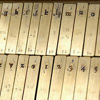
In 1965, Professor David Norton commissioned multiple sets of Goudy’s Sherman typeface to be cast from the original matrices (engraved molds) for the School of Journalism at Syracuse University. These typefaces were used for many years by the journalism students in the Goudy Typography Laboratory. When the process of setting type was no longer an integral part of the curriculum in the Newhouse School of Public Communications, these, and many other Goudy faces, were transferred to the printmaking Page 10 workshop in the School of Art. Many Goudy typefaces originally cast for SU, including the Sherman faces however are today maintained by the Syracuse University Libraries’ Special Collections Research Center, as they are the only known surviving sets. The Painter's Holiday and Other Poems, by Bliss Carman. (New York: privately printed [Sherman], 1911) Note that the title of the volume has been lettered by hand by Frederic W. Goudy, and the volume is printed in the Sherman typeface designed by Goudy. Complete set of Sherman type, 14 pt. Goudy Type Collection This is one of multiple drawers of metal type designed by Goudy in the Special Collections Research Center. This type was cast from the original Sherman matrices for Syracuse University in 1965, originally used by the students of the School of Journalism at Syracuse University. Le Chapeau Immortel, by Earl H. Emmons broadside Frederic W. Goudy Collection Earl H. Emmons was a writer, poet, founder and proprietor of the Maverick Press, and a friend of the Goudys. The illustration of Goudy’s ‘immortal’ hat is by Herb Roth. On the verso of the broadside, a small colophon reads: "Those who know Frederick W. Goudy know also his keen sense of humor. His stories have delighted thousands. Greatest test of all, he enjoys a good story on himself. For this reason we have ventured to publish these verses. Reprinted by permission of the Monotype Group, publishers of "The Composing Room." Handset in Goudy Newstyle. Three hundred fifty copies printed for private distribution in November 1928, this being the first production of [Melbert Cary's] Press of the Woolly Whale." Photograph of Frederic W. Goudy, inscribed “Le Chapeau Immortel” by Goudy. photograph Frederic W. Goudy Collection Fred Cooper cartoon commemorating the 35th Anniversary of The Village Press, 1938 Printed at Marchbanks Press Frederic W. Goudy Collection F. W. Goudy, 1938, by Alexander Stern (1904 - 1994) etching and drypoint Frederic W. Goudy Collection This etching and drypoint depicts Goudy in his library. The print was commissioned in celebration of the 35th anniversary of The Village Press. Keepsake, from the Exhibition of Village Press at The Anderson Galleries, New York, 1922. Frederic W. Goudy Collection In addition to being a publisher, Mitchell Kennerly was also a gallery owner, and directed The Anderson Galleries from 1916 to 1929. The exhibition that centered on the work of the Village Press also highlighted Goudy’s acquisition of William Morris’ own Page 11 Albion Press. Goudy himself printed these impressions, the first prints to be pulled from the press in the United States, and distributed them to gallery visitors. The border design originates from an original drawing by Morris, owned by Goudy. The press is now located at the Rochester Institute of Technology’s Cary Graphic Arts Collection. Frederic W. Goudy crest, designed by Clarence Hornung, 1926 relief print Frederic W. Goudy Collection Clarence Hornung was a noted designer and illustrator known for his prolific output, which included over 400 publishers marks and logos, numerous type designs, and dozens of books. Goudy wrote the introduction to Hornung’s 1954 publication Lettering from A to Z. This early illustration of Goudy, designed in 1926 for the American Type Founders Company, includes the phrase "Quod Si Deficiant Vires, Audacia Certe Laus Erit,” drawn in one of Goudy’s own typefaces. From the Roman poet Propertius’ The Elegies, Book II (c.50 -15 BC), the passage can be interpreted as “If (my) strength fails, certainly (my) boldness will be praised.” A Specimen Sheet Showing Almost All of the “Lost” Goudy Types David M. Norton Collection on Frederic W. Goudy
SHERMAN SANS AND SERIF
In 2016, Syracuse University hired Pentagram, the world’s largest independent design consultancy, to create a new visual identity for the 21st century. When it was discovered that there was a unique connection between the University and Frederic Goudy, and that the Special Collections Research Center was in possession of original Goudy type matrices, the decision was made to incorporate these original artifacts into the project. Pentagram turned to type designer Chester Jenkins to revive the original 1910 Goudy design for a contemporary 2016 digital font. Jenkins worked closely with the design team from Pentagram and special collections curators to create the central element of new SU marque. “While I had Goudy’s original typeface as a starting point, where I ended up was a reinterpretation of Goudy’s idea, not a revival of his letters,” Jenkins explained. The result is a truly unique typeface that captures the spirit of Frederic Goudy’s design and continues the historic bond forged over 80 years ago. Sherman Serif Book is Chester Jenkins’ reinterpretation of Goudy’s original 1912 design. The heavier line weight and clean edges reflect a contemporary aesthetic while embracing the traditional Roman style. Sherman Sans Book is inspired by Goudy’s Sherman. While Goudy rarely created modern sans-serif types, this typeface satisfies the typographical needs of the 21st century, reminiscent of the original structure of Goudy’s design.
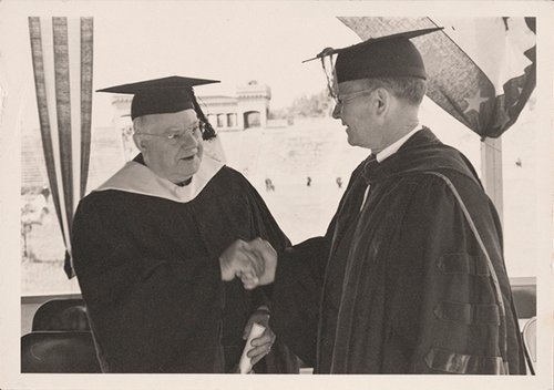
GOUDY @ SYRACUSE
Goudy first visited the city of Syracuse to address the New York Press Association during their fall 1935 annual meeting. Also in attendance was M. Lyle Spencer then Dean of the School of Journalism at Syracuse University. This meeting was the seed that would germinate into the lasting connection between Goudy and Syracuse University. The following year, Spencer and other members of the faculty were invited to Goudy’s workshop in Marlborough, New York, where Goudy had recently completed his 98th typeface. Spencer began to equip a typography laboratory in Yates Castle, the first home of the journalism school, anointing it the Frederic W. Goudy Typography Laboratory. Eager to bolster the relationship of his newly founded program to Goudy, in 1936 Spencer established the medal of distinguished service, and awarded the inaugural honor to Goudy. In 1939, Syracuse University was also the first institution to bestow Goudy with an honorary degree, and appointed him an official lecturer for the school in 1940. Though Goudy died in 1947, his legacy at SU was preserved by many individuals. Professor David Norton used original Goudy artifacts and types while teaching typography, in addition to maintaining the Goudy Typography Lab for the School of Journalism, which later became the S.I. Newhouse School of Public Communication. Once the process of setting type was no longer part of the Newhouse curriculum in the 1980s, Don Cortese, professor of printmaking for the College of Visual and Performing Arts, salvaged the original Goudy type from being recycled. Cortese re-established the Goudy Typography Lab in the Comstock Art Facility, where it continues to engage students with Goudy’s original materials and process. The link between Goudy and Syracuse University also endures today through the University’s visual identity which embraces new digital versions of Sherman Serif and Sherman Sans. How Frederic W. Goudy Designed Type David M. Norton Collection on Frederic W. Goudy This large poster illustrates the stages of type design, from sketch to final printed specimen, using original Goudy artifacts. It was created for instructional use by Professor David Norton. I Bring You Gifts, Words of M. Lyle Spencer to Frederic Goudy on the occasion of the presentation of a testimonial tribute to Goudy at the Hotel New Yorker, March 24th, 1939. Frederic W. Goudy Collection Set up and printed at the New York School of Printing under the direction of Henry Holloway. A copy was presented to each person who attended the dinner. SCRC has multiple copies. Photograph of Fred W. Goudy, 1935. Inscribed to the School of Journalism, Syracuse University, Syracuse, N.Y. David M. Norton Collection on Frederic W. Goudy This photograph and broadside once hung in the original location of the Frederic W. Goudy Typographic Laboratory in Yates Castle, as seen in the photograph of students in the lab. Photograph of the Frederic W. Goudy Typographic Laboratory, Yates Castle. reproduction University Archives Photograph Collection Types of the past, type revivals: with a few words on type design in general; an address from the New York Press Association dinner, September 12, MCMXXXVI, by Frederic W. Goudy, with a foreword by Howard Coggeshall and a presentation by M. Lyle Spencer. 1936. Dean M. Lyle Spencer of the School of Journalism commissioned not one, but two versions of a publication to commemorate this award. One was issued with a colophon indicating that “five hundred copies have been printed specially for presentation to members of the American Institute of Graphic Arts as Keepsake No. 55 of the Institute series.” The other iteration’s colophon explained that “[o]ne thousand copies of this book have been made for distribution by the Syracuse University School of Journalism.” Both versions of the publication were printed on Permanent Bond paper donated by the Worthy Paper Company of West Springfield, Massachusetts, who also created the watermark portrait of Frederic Goudy that appears on the first and last leaves of the volume. The text was composed and printed in Bertham type by Howard Coggeshall in Utica, New York. A copy of the version distributed by the School of Journalism includes the signatures of Frederic W. Goudy, Howard Coggeshall, Fred W. Main (of the Worthy Paper Company), and M. Lyle Spencer on the inside front cover. Page 231 of A Half-Century of Type Design and Typography, 1895–1945 by Frederic W. Goudy. (New York: Typophiles, 1946) This memoir is considered by many to be Goudy’s autobiography. The selected page displays the only lowercase roman letters of the typeface designed by Frederic W. Goudy in honor of M. Lyle Spencer, the dean of the School of Journalism at Syracuse University. Goudy named the font Spencer Old Style. Photograph of Frederic W. Goudy and M. Lyle Spencer at Syracuse University commencement, 1939. reproduction University Archives Photograph Collection This is the only known photograph of Frederic W. Goudy at Syracuse University, with M. Lyle Spencer at right. Goudy and Spencer are shown after Goudy received his honorary degree. The grandstands of Archbold Stadium can be seen in the background. Syracuse University holds the distinction of being the first academic institution to bestow Mr. Goudy with an honorary degree. The correspondence to nominate Frederic Goudy for this special distinction began in 1936 by Oscar P Shaw, the manager of the Parker Building at 225 Fourth Avenue in New York City, third home of The Village Press. Letter from Oscar P Shaw, Jr. to Chancellor Charles W. Flint, May 7, 1936, to nominate Goudy for an honorary degree from Syracuse University. University Archives, Chancellors Charles Wesley Flint and William Pratt Graham Papers Letter from Dean M. Lyle Spencer to Chancellor William P. Graham, March 8, 1938, to nominate Goudy for an honorary degree from Syracuse University. University Archives, Chancellors Charles Wesley Flint and William Pratt Graham Papers “To date Mr. Goudy has not been recognized by an honorary degree from any university. My opinion is that we should honor not only him, but ourselves, in giving him recognition.” Copy of a letter from Chancellor W. P. Graham to Mr. Frederic W. Goudy, March 19, 1939, to award Goudy the honorary degree of Doctorate of Humane Letters from Syracuse University. University Archives, Chancellors Charles Wesley Flint and William Pratt Graham Papers Letter from Frederic Goudy to Chancellor W. P. Graham, April 25, 1939, accepting the honorary degree from Syracuse University. University Archives, Chancellors Charles Wesley Flint and William Pratt Graham Papers Progressive Typography by David M. Norton. (Syracuse, N.Y.: Spare Moments Press, 1961) Great Races: Six major type classifications and their relation to the typefaces in the Frederic W. Goudy Typographic Laboratory (Syracuse, N.Y.: School of Journalism, Syracuse University, 1967) These two publications were printed in the Frederic W. Goudy Typographic Laboratory and incorporated many of Goudy’s types used by students in the School of Journalism at Syracuse University. The Record of Goudy Types, printed as a memento for visitors at the celebration of the 35th anniversary of the Village Press, 1938. Frederic W. Goudy Collection “…complete and up to the moment, composed in Goudy Italian Old style.” This keepsake illustrates the 107 typefaces designed by Goudy as of 1938. Photograph of Frederic W. Goudy and M. Lyle Spencer, at the testimonial event for Goudy held at the Hotel New Yorker, 1939. reproduction Frederic W. Goudy Collection A black-and-white photograph of Frederic W. Goudy being presented with a testimonial fund of two-thousand dollars collected by Dean M. Lyle Spencer of the Syracuse University School of Journalism from members of the graphic arts community after a disastrous fire destroyed Goudy’s Village Press workshop in Marlboro, New York. The purpose of the fund was to assist Goudy in recreating a studio for his typographical pursuits. Books: The Soil of the Spirit, broadside David M. Norton Collection on Frederic W. Goudy Designed and printed by David M. Norton in the Frederic W. Goudy Typographic Laboratory, School of Journalism at Syracuse University. The prints were offered as keepsakes for an event at the Syracuse University Library. I Think of a Letter, 1989 broadside, artist’s proof, artist unknown David M. Norton Collection on Frederic W. Goudy Original sketches for Sherman Serif Book Italic, 2016. Chester Jenkins Collection, University Archives Jenkins can be seen sketching these iterations of Sherman Serif Book Italic in the mini documentary Goudy & Syracuse: The Tale of a Typeface Found, produced by Dress Code, NY. The video recounts the rediscovery of Sherman, a typeface designed by Frederic Goudy in 1910 and revived by Jenkins in 2016 for Syracuse University. Sherman Book presentation document from Pentagram from April 19, 2016. Chester Jenkins Collection, University Archives This original document demonstrates the collaborative and critical back and forth between Chester Jenkins of Village Type Foundry and the design team at Pentagram, including notes and inscriptions by Michael Beirut and Jesse Reed. This unique record of the project gives rare insight into the creative process that resulted in Syracuse University’s Sherman Book types. Photographs from glass plates depicting Goudy designing and cutting type, courtesy of Joe Weiler, Jr. reproductions Frederic W. Goudy Collection These photographs illustrate Goudy’s process to engrave matrices from his original design. Goudy created the master pattern by cutting his traced design out of Bristol board and mounted it to heavy cardboard. He then used a machine called a vertical pantograph to trace, reduce, and engrave the design into a sheet of metal, making the working pattern. This miniaturized version of the typeface was then used as the guide for the pantograph to engrave the brass matrices used to cast the type in their finished size. Syracuse Daily Orange, March 31, 1936 reproduction University Archives Syracuse Daily Orange, December 1, 1936 reproduction University Archives Syracuse Daily Orange, December 11, 1936 reproduction University Archives The articles in these student newspapers chronicle the foundation of the connection between Goudy and Syracuse University, beginning with a visit to address the New York Press Association in late 1935 to the inaugural medal for distinguished service issued by the School of Journalism in December of 1936. The prototype of the first medal for distinguished service issued by the School of Journalism at Syracuse University. University Archives, M. Lyle Spencer Papers Designed by Walter K. Long and struck by the American Emblem Company. The medal was presented to Frederic W. Goudy in December of 1936 for distinctive achievement in typographic design. Photograph of Professor David Norton teaching typography. reproduction University Archives Photograph Collection Photograph of a student inking hand-set type letterhead for printing. reproduction University Archives Photograph Collection This photograph illustrates the last assignment where students used hand set type in the S.I. Newhouse School of Public Communication, circa 1985. The metal type and presses are now located at the printmaking workshop in the Comstock Art Facility.